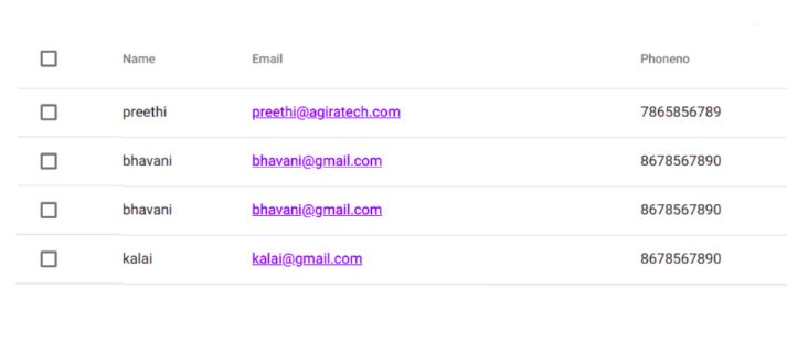
Angular Material is used to display rows of data and styled data tables. The Angular Material Data Table component is a generic component for displaying tabulated data. We can easily give it the finest look and feel with the material design.
MatTable is built on the foundation of the Component Dev Kit (CDK) data-table and uses a similar interface for its data input and template. Its element and attribute selectors are prefixed with mat- instead of CDK. The use of CDK is a library of predefined behaviors included in Angular Material, a UI component library for Angular developers and CDK contains reusable logics for many features. Let’s discuss how you can create your own generic MatTable with Angular components.
Angular Material Table
Install an Angular 8, we are using Angular CLI Version 8 for this tutorial demonstration. If you’re new to Angular, I recommend you to follow these steps with Angular 8.
Install Angular 8
Type the following command to install Angular.
install -g @angular/cli
Now, generate the Angular project using this command below.
ng new mat-table-example
Install Angular Material Libraries
Now, install Angular Material and Angular Animations using the following command.
npm install –save @angular/material @angular/animations @angular/cdk
Go inside the project folder and install the Hammer.js using the following command.
npm install –save hammerjs
Hammer.js is an optional dependency and helps with touch support for the components. You should include Hammer.js inside an angular.json file. Now, you will be able to find this file on the root of this Angular project.
"scripts": [
     "./node_modules/hammerjs/hammer.min.js"
]
Import a pre-built theme and Material Icons
Angular Material comes with some pre-built themes, colors and basic styles. Some of the default themes are indigo-pink, deep-purple-amber, purple-green, and pink-blue-grey. To import the theme in our project, we can add the following code to your global styles.css file. The file is inside the src folder.
@import ‘~@angular/material/prebuilt-themes/indigo-pink.css’;
Now we need to import Angular Material modules and BrowserAnimationsModule files inside the app.module.ts file.
// app.module.ts
import { BrowserModule } from '@angular/platform-browser';
import { NgModule } from '@angular/core';
import { BrowserAnimationsModule } from '@angular/platform-browser/animations';
import { MaterialModule } from './material.module';
import { AppComponent } from './app.component';
@NgModule({
  declarations: [
    AppComponent
  ],
  imports: [
    BrowserModule,
    MaterialModule,
    BrowserAnimationsModule
  ],
  providers: [],
  bootstrap: [AppComponent]
})
export class AppModule { }
MatTable Module
Angular Material is used to display rows of data. It also provides an Angular Material design with a styled data table. You should write the following code inside the app.component.ts file to import the MatTable module.
// app.component.ts
import {Component} from '@angular/core';
@Component({
  selector: 'app-root',
  styleUrls: ['./app.component.css'],
  templateUrl: './app.component.html',
})
export class AppComponent {
  displayedColumns: string[] = ['name',email, phoneno];
  dataSource = ELEMENT_DATA;
  selection = new SelectionModel(true, []);
}
export interface PeriodicElement {
  name: string;
  email: number;
  phoneno: string;
}
const ELEMENT_DATA: PeriodicElement[] = [
  {name:’preethi’,email: ‘preethi@agiratech.com’, pnoneno:7865856789},
  {name:’bhavani’, email: ‘bhavani@gmail.com’, pnoneno:8678567890},
  {name:’bhavani’, email: ‘bhavani@gmail.com’, pnoneno: 8678567890},
  {name:’Kalai’, email:’kalai@gmail.com’, pnoneno: 8678567890},
];
/** Whether the number of selected elements matches the total number of rows. */
 isAllSelected() {
   const numSelected = this.selection.selected.length;
   const numRows = this.dataSource.length;
   return numSelected === numRows;
 }
 /** Selects all rows if they are not all selected; otherwise clear selection. */
 masterToggle() {
   this.isAllSelected() ?
     this.selection.clear() :
     this.dataSource.forEach(row => this.selection.select(row));
 }
Here, we have defined the PeriodicElement interface with the four variables. It is a model that has its properties with the datatypes.
Inside the app.component.css file, we can write the CSS code.
table {
  width: 100%;
}
Finally, write the HTML code inside the app.component.html file.
<table mat-table [dataSource]="dataSource" class="mat-elevation-z8">
  // Checkbox Column
  <ng-container matColumnDef="select">
     <th mat-header-cell *matHeaderCellDef>
       <mat-checkbox (change)="$event ? masterToggle() : null" [checked]="selection.hasValue()    && isAllSelected()"
         [indeterminate]="selection.hasValue() && !isAllSelected()">
       </mat-checkbox>
     </th>
     <td mat-cell *matCellDef="let row">
       <mat-checkbox (click)="$event.stopPropagation()" (change)="$event ? selection.toggle(row) : null"
         [checked]="selection.isSelected(row)">
       </mat-checkbox>
     </td>
   </ng-container>
// Mat Table Column
 <ng-container matColumnDef="name">
    <th mat-header-cell *matHeaderCellDef> Name</th>
    <td mat-cell *matCellDef="let element"> {{element.name}} </td>
  </ng-container>
  <ng-container matColumnDef="email">
    <th mat-header-cell *matHeaderCellDef> Email</th>
    <td mat-cell *matCellDef="let element"> {{element.email}} </td>
  </ng-container>
  <ng-container matColumnDef="phoneno">
    <th mat-header-cell *matHeaderCellDef> Phone No</th>
    <td mat-cell *matCellDef="let element"> {{element.phoneno}} </td>
  </ng-container>
  <tr mat-header-row *matHeaderRowDef="displayedColumns"></tr>
  <tr mat-row *matRowDef="let row; columns: displayedColumns;"></tr>
</table>
Save a file and run the following command to look at the final result.
ng serve

Also Read: How to Cache HTTP Requests In Angular
Conclusion
I hope this Angular 8 material Table tutorial was useful for you. We can expand the data table with more features such as pagination, sorting, filtering, searching, and add all possible features with the help of the Angular Material table.
Happy learning!
Have some love for Angular? Be a well informed on all Angular updated by subscribing to the weekly newsletter. Fill the form and become a subscriber to access more exclusive updates on Angular and other development technologies.
Wondering Angular is the one for your Project? Talk to our technology experts today to find the high compatible framework for your development project.


