Is Angular Material Design?
- form controls (input, select, checkbox, date picker, and sliders, etc.),
- navigation patterns (menus, sidenav, and toolbar)
- layout components (grids, cards, tabs, and lists )
- buttons indicators (progress bars and spinners)
- popups and modals data tables with headers and pagination etc.
Features Of Angular Material Design
- Supports in-built responsive design.
- Provides new common user interface controls such as buttons, checkboxes, and text fields.
- Provides enhanced features like cards, toolbar, speed dial, side nav, swipe
Before building a login page, follow the below steps to set up the Angular application,
- Setup & install an angular application
- Integrating angular material design
- Integrating angular flex layout
Setup & Install Angular Application
In case if you have already installed “@angular/cli” package then you can directly use the following comment to create a new angular application.
ng new my-login-app
In case, if you haven’t installed “@angular/cli” then you can use the following code to install Angular CLI
npm install -g @angular/cli
After installation, you can start creating your new angular application & give the name you wish. So in our example, i have named “my-login-app”.
ng new my-login-app
During your app creation, it will ask you for the following details,
Would you like to add Angular routing?
If you want router in your application then Press “Y” and enter.
Which stylesheet format would you like to use?
To select the stylesheet format use arrow keys like less, CSS, sass and press enter.

Next, navigate to the create app folder using the below command,
cd my-login-app
Now run the application using the following command,
ng serve
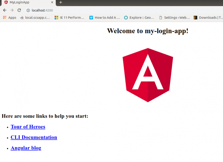
After running the above command, you will get the live development URL of the application by default http://localhost:4200
Integrate Angular Material Design
npm install --save @angular/material @angular/cdk @angular/animations
import {BrowserAnimationsModule} from '@angular/platform-browser/animations';
                @NgModule({
                 ...
                 imports: [BrowserAnimationsModule],
                 ...
                })
                export class AppModule { }
@import "~@angular/material/prebuilt-themes/indigo-pink.css";
npm install --save hammerjs
import 'hammerjs';
Integrating Angular Flex layout
npm install -save @angular/flex-layout
Next import the FlexLayoutModule to the app module file.
import {BrowserAnimationsModule} from '@angular/platform-browser/animations';
                import { FlexLayoutModule } from ‘@angular/flex-layout’;
                @NgModule({
                 ...
                 imports: [
                BrowserAnimationsModule,
                FlexLayoutModule
                ],
                 ...
                })
                export class AppModule { }
Related: Angular 4 Template Driven Forms : Building and Validating Forms
Create an Angular Login Form
cd <project path>/src/app
  ng generate component login
ng g c login
import { LoginComponent } from './login/login.component';
                        @NgModule({
                        declarations: [
                          LoginComponent
                        ]
                        })
const routes: Routes = [
                {
                  path: '',
                  component: LoginComponent
                }
                ];
import {
                MatFormFieldModule,
                MatInputModule,
                MatCardModule,
                MatButtonModule
                } from '@angular/material';

                @NgModule({
                imports: [
                  MatFormFieldModule,
                  MatInputModule,
                  MatCardModule,
                  MatButtonModule
                ]
                })
Angular Material Components Explained:
<mat-form-field> is a component used to apply common Text field styles such as the underline, floating label
This is directive that allows native <input> and <textarea> elements to work with <mat-form-field>
This module used to apply the common button style.
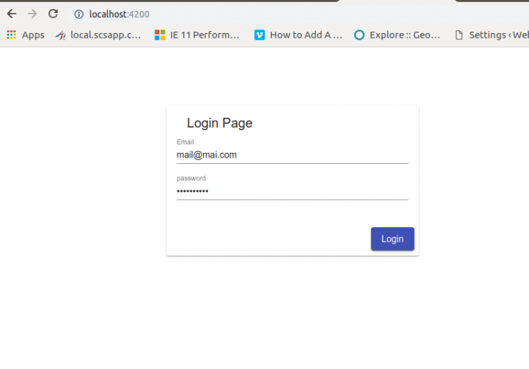
<div fxLayout="row" fxLayoutAlign="center center" class="login-main">
                        <mat-card >
                        <mat-card-header>
                          <mat-card-title>Login Page</mat-card-title>
                        </mat-card-header>
                        <mat-card-content fxLayout="column">
                          <mat-form-field>
                            <input matInput placeholder="Email">
                          </mat-form-field>
                          <mat-form-field>
                            <input type="password" matInput placeholder="password">
                          </mat-form-field>
                        </mat-card-content>
                        <mat-card-actions align="end">
                          <button mat-raised-button color="primary">Login</button>
                        </mat-card-actions>
                        </mat-card>
                        </div>
.login-main{
                margin-top: 10%;
                }
                mat-card{
                min-width: 40%;
                }


